
Analysis of Rihanna’s digipak “Loud”
- Erica Li
- Nov 19, 2021
- 1 min read
In Rihanna’s digipak of “Loud”, a high contrast colour palette is represented with pink and blue. Pink mostly is represented as femenine and girly, which is considered as a more childish colour, however, dark blue reveals a mature sense of calm, and represents power and independence. The combination of the bright colours have represented feminism and reveals a stereotype of women in age between young and mature. As the pink is represented strongly like a colour near to red, it also has represented meaning of sex and passion. However as the colour is still not red, pink reduces the representation of violence and fear as what red should create.
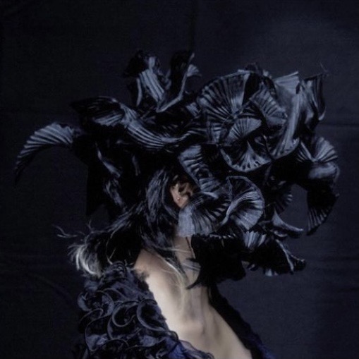
Close up shot with Rihanna’s face has been used for the cover of the digipak. This illustrates Rihanna’s confidence of showing herself, and can clearly see her beautiness and the smoothness of the skin, which represents youth or richness.
Adding on, Rihanna’s facial expression can be clearly seen to provide emotive and meaning, also to establish intense focus. Flowers can be associated with feeling, natural, metaphors, feminism and women. Therefore, the flowers and the colour palette of digipak “Loud” has strongly established the meaning of “love”, as this album is released on Valentine’s day.


Comments